


Rebranding An Established Business
Aquamark Window Cleaning


We love brand
identity design
Aquamark a London-based specialist in commercial window cleaning, is trusted for high-rise projects, residential blocks, and complex cleans.
They partnered with Turquoise Creative to reposition and rebrand their established business, ensuring their identity reflects their expertise and ambition.
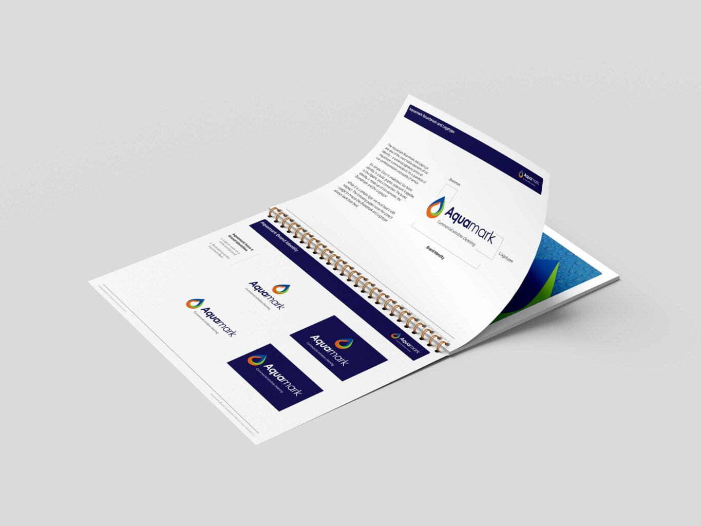
Brand guidelines and
style guide
We developed a comprehensive set of brand guidelines to ensure consistency across every touchpoint.
These guidelines outline everything from logo usage and colour specifications to typography rules and clear dos and don’ts—providing Aquamark with the tools to keep their brand strong and cohesive.
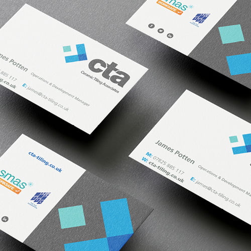
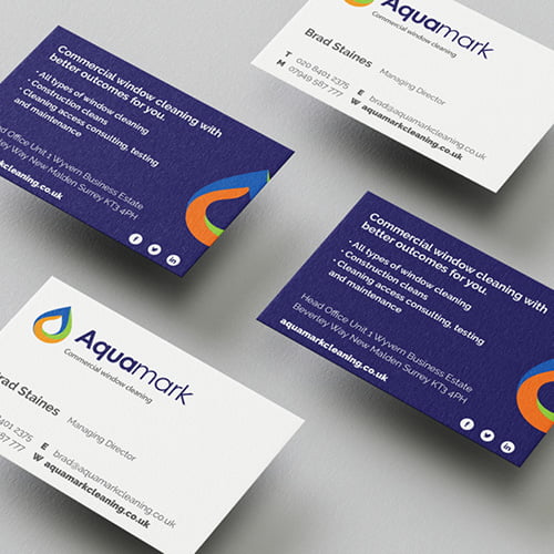
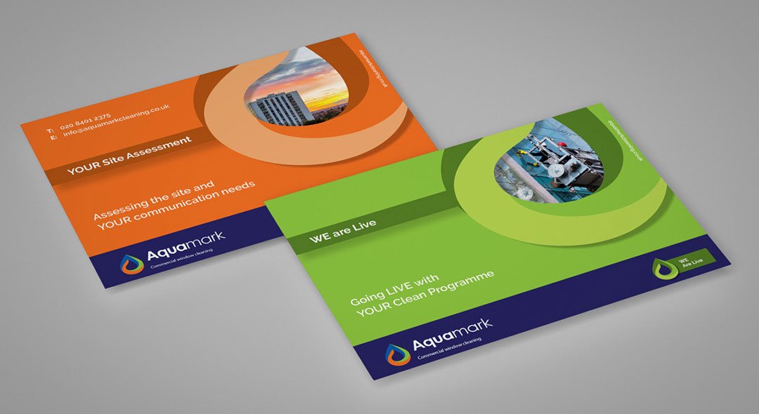
Business stationery
design and print
As with all our brand identity projects, we designed purposeful logo variations to give Aquamark a flexible, adaptable identity that works across different applications.
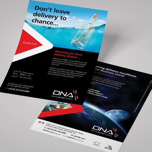
To complete the rollout, we also created a suite of business stationery, including letterheads, compliment slips, and business cards – ensuring the new brand is professional and consistent at every touchpoint.
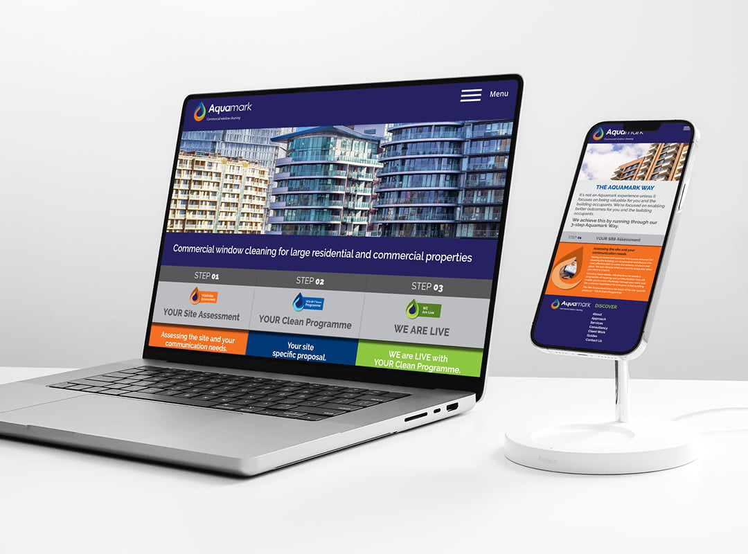
Web design and
application
We designed and developed a fully bespoke WordPress website, tailored to Aquamark’s exact needs—both in design and functionality.
But great web design goes beyond visuals. From site architecture and wireframes to prototypes and content planning, every stage of the process was carefully considered to ensure the finished site is as intuitive as it is impactful.aquamarkcleaning.co.uk
The old brand identity
Aquamark’s old logo was functional but lacked the strength and impact needed to represent a leader in the commercial window cleaning industry. Its simplicity meant it didn’t fully convey the scale, professionalism, or ambition of the business.
As part of the rebrand, we streamlined the name down to simply “Aquamark”—a bold move that gave the brand greater clarity and memorability. To inject vibrancy and recognition, we introduced a fresh three-colour palette, carefully chosen to reflect the company’s energy, reliability, and expertise.
The result is a modern, confident logo that works seamlessly across digital and print applications, while giving Aquamark a distinctive identity that stands tall in a competitive market.

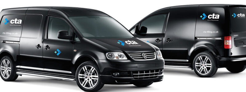
Signage and workwear
The logo was then applied to clothing and exterior signage.
A fleet of vans had new livery applied to show off the new branding.

Get in touch to find out more about our work or any of our other creative services.
Explore our work.