


The Importance of Typography
Have you ever wondered about the importance of typography?
As a marketing director or business owner, the answer may be: no, not really. You’ll have many critical aspects of business promotion and growth on your agenda; in your proverbial in-tray. And, if we may be so bold, typography may not be one of them. Yet, typography is quite literally everywhere, influencing our thoughts and feelings.
And yes – even our decision-making.

This article explains what it is, what it does, and how excellence in brand design goes hand-in-hand with typography. In fact, it IS brand design. And, how it could affect how your target market digests and perceives your entire organisation.
Yes, it’s that big:
Its mission, values, and approach. Not least, how it serves your customers. Or, is likely to. A crucial part of your branding, typography distils what you do and how you do it.

Talk to us.
How would you like others to see you?
Keen to learn more?
If you’re considering a re-brand, talk to Turquoise Creative.
This is a creative, technical skill requiring knowledge of typefaces (fonts), colours, layout, and much else. More importantly, however, typography evokes certain emotions. We decide to buy something with our hearts, rather than our heads. The mindset connection is obvious.
Excellence in typography is the brand designer’s forte: we create or can help create feelings. Let us explain.
What is Typography?
Broadly, typography is the art of creating a style of printed text to make it visually appealing to a particular audience.
Likewise, making it ultra-clear, readable, and meaningful. The choice of fonts, how we adapt them, the colours we choose, and how we structure it all comes together in one substantial yet subtle impact, and it’s this:
The message that a brand conveys. – Typography holds everything together.
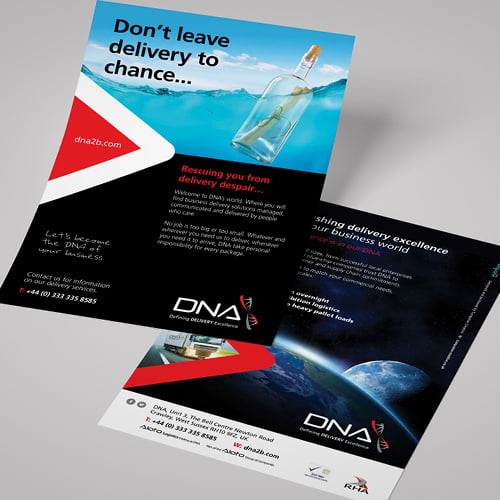
In short, there’s an awful lot to it. Whether in a logo, on a website, brochure, banner or any media, typography brings the text to life.
In brand design, a designer needs to consider the relationship between the look of the text and what the text actually says. We’d go as far as to say that different moods, atmospheres and even industry trends can be expressed simply through typography.
Or perhaps, to be fair, not quite so simply.

A Word on Fonts.
The contemporary world of branding is extremely broad.
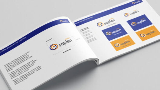
In typography, we talk about a font “family”. For example, the Lato font is a design style with various weights, widths, and tones. Think about a tree (the main font) with several branches (font types).
What can Typography do for You?
1. Communication.
Do you offer state-of-the-art, cutting-edge IT expertise? Perhaps your business is front and centre of the AI revolution. Let’s talk fonts.
In that case, something like this wouldn’t work:

This one’s a serif font – something with a small line or stroke attached to the end of a larger stroke or letter. Little marks or “kicks”, as it were. Quite attractive but a little old-fashioned.
A better choice would be this, sans-serif font:

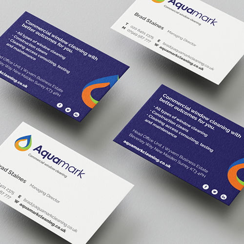
The font we use and how we use it should start to tell your target market what your business does. Think about this point: if there was no logo, would you still be able to discern the brand simply from its font? If so, this is good work, brilliantly done.
2. Builds Brand Recognition.
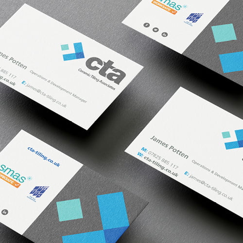
Effective typography is about your brand’s unique personality – a look and feel your target market associates with your business only. This recognition should cross channels – your website, social media, print collateral, point-of-sale materials, even digital billboards, for example – and build consistent, psychological links.
It can carry your brand forward and create a strong user following.
3. Promotes Legibility.
It almost goes without saying that typefaces/fonts, colours, size and structure, and layout must all combine into one easy-to-read, clean, clear result.
If a design is busy, overcrowded, or requires your user to squint to understand it, you’ll just make them feel tired. Excellent copy and content are vital. Yet, poor typography can bring it all down.
4. Looks Great.
Here, we’re all about aesthetics.
In other words, typography delivers a positive customer experience when everything looks very, very good. If something is ugly, with clashing colours and “aggressive” fonts, nobody will read it. A brand specialist can help you avoid what, without skill and experience, could deliver a disappointing sales prevention system. (Can you rewrite it so it’s clearer?
This decorative function is especially important in logos, brand names, and short titles, as it empowers a brand to show its personality with the ultimate panache.
5. Captures Attention and Keeps It.
Effective typography could mean someone engages with your brochure or website for minutes – or longer, rather than seconds.
How?
Through adapting a font, knowing where we place it, using the right colours, and arranging the text with care all unite to enable your branding to “stick”.

Things to Know About Typography.
Consistency.
Branding specialists such as Turquoise Creative recognise continuity; we avoid mess.
Therefore, in a brochure that conveys information, generally, we’ll use a consistent style so that your readers understand instantly what they’re reading. They’ll start to recognise a pattern. Headings will be uniform, with the body text font continuous throughout.
Colours.
Colours play a key role in typography. And, a good designer never underestimates its make-or-break influence.
Let’s go for exclusivity.
Colours mustn’t replicate those of a supplier or a competitor; this is lazy and could be confusing. In addition, we know about tone and saturation. Again, it’s understated but reflects the nature of what your business does.
Likewise, certain hues complement each other and please the eye. Others clash horribly.
Colour psychology is a buzzword phrase, but it’s everywhere: blues represent reliability, red makes us excited (and hungry, by the way), yellow is uplifting and black is serious.
Hierarchy.
Hierarchy concerns making some pieces of copy more prominent – those that should be read and absorbed first – versus other, more standard text.
This means clever use of sizing, colour, contrast and alignment (ensuring the best space and distance between each element).
Why is this important? Because, even with printed material, most of us have outstandingly short attention spans. Being concise, precise and to the point equals impact – and a persuasive message.
Final Words from Turquoise Creative – Key Take-Aways on the Importance of Typography
Excellent typography relates to arranging letters and words in such a way as to convey something: a feeling, an emotion, or a meaning of some kind. As this article implies, it’s more involved than you may realise, as this article implies.
The best branding guides, informs, and offers an exceptional customer experience; an immediate, instantaneous response that touches perception. Call it instinct.
What kind of difference would these concepts make to your business?
Get in touch with Turquoise Creative, and let’s get that communication going.