Skip to content
Get in touch
Turquoise Creative
Contact
Turquoise Creative

Website Navigation

Brand Design in Sussex.
Creative thinking to grow your business.

Expertise


  • brand design
    Brand
  • logo design
    Logo
  • advertising design
    Advertising
  • direct marketing design
    DM
  • exhibition design
    Exhibition
  • web design
    Web

About Us


  • Testimonials
    About Us
  • Testimonials
    The Team
  • Testimonials
    Testimonials
  • Testimonials
    Contact Us

Our Work


  • World in Ruins book design

Blog


Why First Impressions Matter More Than Ever

3 minute read.

Why Choose Turquoise Creative for Your Branding Projects

3 minute read.

The Benefit of a Brand Audit to Your Business

2 minute read.

How Your Brand Identity Directly Impacts Sales, Growth, and Results

2 minute read.

Understanding the Difference Between Marketing and Branding

3 minute read.

How can a set of brand guidelines help your business?

6 minute read.

About us

Bringing brands to life, while giving you a creative advantage.
Turquoise Creative is the inspiration of Steve Oakes, branding specialist.

The Team

Who makes Turquoise tick.
We’re branding specialists, serving the needs of the SME and corporate sectors throughout Sussex, and the South East.

Website Design

Testimonials

Hear what our clients have to say Turquoise Creative has been shaping brands for over 15 years thanks to our many clients.

Want to discuss your next project ?
Get in touch

Contact Us

Call : 07813 339789

E : ideas@turquoise-creative.co.uk

Turquoise House
35 Henley Close
Crawley
West Sussex RH10 7QU

Turquoise Creative Ltd is registered in England No. 06466424

Quick article navigation
  • A more progressive brand
  • Preparing Toyota for the years to come
  • The rise of the flat logo
Home » Our Blog » News & Views » Toyota reveals new logo

Toyota reveals new logo

BySteve Oakes May 24, 2022 4 minute read.

Toyota reveals new logo and visual identity for Europe

The “forward-facing” brand identity for the Japanese car company Toyota includes an on-trend flat logo in an attempt to create a more “premium” appearance.

Toyota has unveiled a new logo and visual identity for its Europe division, which looks to oversee the car company’s journey into a “more progressive brand”.

The identity – designed by international consultancy The&Partnership – will be used across all internal and external brand communications. The&Partnership’s European design team is behind the work, which includes a redesigned logo, colour palette and typeface.

Toyota new logo

The&Partnership head of design Dan Beckett tells Design Week that the previous identity – not changed since 2009 – was beginning to feel “tired”. It needed to be more “premium”, “forward-facing” and better adapted to mobile platforms, he adds.

A more progressive brand

toyota new logo

The aim of the refresh was to “build Toyota’s image as a more progressive brand” as well as “guaranteeing longevity in a digital world”. The communications had to match that ambition, according to The&Partnership. The design work started in July 2019.

It also comes at a time of change for the Japanese car company, which is now undergoing a “rapid expansion into electrified vehicles”. At the 2020 Consumer Electronics Show in Las Vegas, U.S, Toyota announced plans for a “fully connected ecosystem” at the base of Japan’s Mount Fuji.

toyota new logo

At the centre of the new identity is the redesigned logo, which like VW, BMW and most recently Nissan, is now a flattened, two-dimensional design. This will hopefully help it transition into a more “digital” future. Beckett says that the design team considered changing the logo’s colour to red, but that the monochrome version was more in keeping with the brand’s “premium” aesthetic.

Also notable is that the logo loses the Toyota wordmark. This is an acknowledgement of its status as one of the most recognisable brands in the world”. It also means that the branding appears “clearer” and with less visual clutter.

toyota colour palette

Preparing Toyota for the years to come

There is also a bespoke typeface for the identity, Toyota Type. The sans serif font “enhances clarity and consistency” across the brand’s communications. It was originally created by the company’s North American division, in partnership with Monotype. The&Partnership has set specific guidelines for its use, however. It’s being used in lighter weights and only in uppercase to align with the brand’s more “premium” audience in Europe.

The studio has also updated the primary colour palette, which is a “clean” and “premium” black and white colourway with a red accent which “provides a distinctive nod to Toyota”. The tagline – Always a Better Way – has been dropped in a “simplification” move, Beckett explains. There are also new “simplified” layouts, which are an attempt to add a coherence to branding.

toyota typeface

Beckett says: “The key to this project was not to simply see it as a bringing the brand identity up to date, but preparing it for years to come. As well as re-modernising the brand we also sought to bring a more premium feeling while working hard to simplify the brand architecture and creating a design system which will be fluent across today and tomorrow’s touchpoints.

“Toyota has recently made great forward strides in its product design and we really wanted to see that reflected in the visual identity.”

The rise of the flat logo

bmw logo
BMW’s redesigned logo

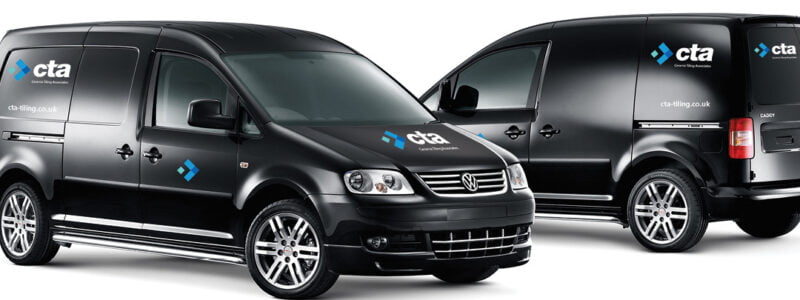
The two-dimensional logo has swept the automobile world in the past year. In September, VW unveiled its two-dimensional logo which first appeared on its electric range of vehicles. BMW revealed a similarly flat logo earlier this year, and had to clarify that it will be used only for brand communications at the moment. Last week, Nissan revealed its redesigned logo which followed suit. It will appear on vehicles and communications.

By Henry Wong – Design Week


Share this page -
Post Tags: #brand identity#branding#design#identity#logo#logo design

Post navigation

Previous Previous
New Mitre football design
NextContinue
The 3 Core Components of your Brand Story
Facebook Linkedin Instagram

© 2025 Turquoise Creative Ltd. All trademarks acknowledged. All rights reserved. Website site development by Turquoise Internet. Turquoise Creative Ltd is registered in England No. 06466424

Similar articles you might find interesting

Moodboards
Moodboards: the most important step in the Branding Process
4 minute read.
How can a set of brand guidelines help your business?
6 minute read.
Turquoise Creative
Turquoise Creative studio is finished
1 minute read.
sports direct
Sports Direct rebrands in a bid for equality
3 minute read.
Branding through a Crisis
3 minute read.
Brand Marketing
Brand Marketing – Making it Work
3 minute read.
I Can’t Believe This !!!
1 minute read.
Unique Business Networking Event
1 minute read.

We only use essential cookies on this site, learn more

Got it

Discover more about our work

Show me...
Scroll to top

Website Navigation

Brand Design in Sussex
Creative thinking to grow your business

Expertise


  • brand design
    Brand
  • logo design
    Logo
  • advertising design
    Advertising
  • direct marketing design
    DM
  • exhibition design
    Exhibition
  • web design
    Web

About Us


  • Testimonials
    About Us
  • Testimonials
    The Team
  • Testimonials
    Testimonials
  • Testimonials
    Contact Us

Our Work


  • World in Ruins book design

Blog


Why First Impressions Matter More Than Ever

3 minute read.

Why Choose Turquoise Creative for Your Branding Projects

3 minute read.

The Benefit of a Brand Audit to Your Business

2 minute read.

How Your Brand Identity Directly Impacts Sales, Growth, and Results

2 minute read.

Understanding the Difference Between Marketing and Branding

3 minute read.

How can a set of brand guidelines help your business?

6 minute read.

About us

Bringing brands to life, while giving you a creative advantage.
Turquoise Creative is the inspiration of Steve Oakes, branding specialist.

The Team

Who makes Turquoise tick.
We’re branding specialists, serving the needs of the SME and corporate sectors throughout Sussex, and the South East.

Website Design

Testimonials

Hear what our clients have to say Turquoise Creative has been shaping brands for over 15 years thanks to our many clients.

Want to discuss your
next project?

Get in touch

Contact Us

Call : 07813 339 789

E : ideas@turquoise-creative.co.uk

Turquoise House
35 Henley Close
Maidenbower, Crawley
West Sussex RH10 7QU

Turquoise Creative Ltd is registered in England No. 06466424