


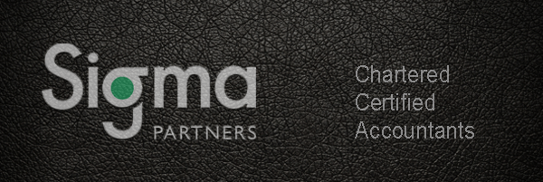
Sigma Partners
Sigma Partners is a firm of experienced and qualified Chartered Certified Accountants with a long record of excellence. From our base in Mid Sussex, we are well placed to meet the accountancy needs of any small and medium-sized business.
It’s a competitive world!
The results of a Google search for ‘Accountant in <your county>’ return pages and pages of suggestions. This just confirms how competitive the accountancy industry is. Add to this the emergence of cloud technology, accountancy practices need to adapt and add value in order to stand out from the crowd.
Out with the old…
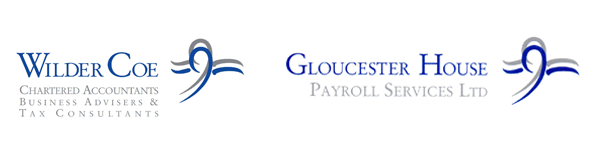
We met a forward-thinking team of partners in July 2016, whilst they were still trading as Wilder Coe. At the time, they were going through a restructuring of the business. The evolution meant a complete name change was required and a new brand identity design that could incorporate two parts of the new business; the accountancy practice and the payroll bureau.
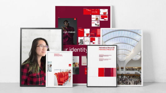
In with the new brand identity
The steps to creating a brand were completely unknown to the partners, so they were extremely happy to be guided by us throughout the process.
The name…
Firstly, we needed to come up with a new name. The name needed to reflect the firm’s experience as qualified Chartered Certified Accountants and their long record of excellence. It had to appeal to its target market; budding entrepreneurs established businesses and individuals in vocational fields.
During a fun and energetic meeting, which we facilitated, the partners decided on the name Sigma Partners.
The logo…
The next step was to develop a series of brand identity designs playing on the sigma symbol.

The uppercase sigma is familiar to those regularly using spreadsheets, however, the lowercase sigma symbol is not so well known and this is what we incorporated into the logotype to create a subtle but memorable identity.

The colours…
Research reinforces how important colour is when developing a brand identity:
- 60% of the time people will decide if they are attracted or not to a message – based on colour alone!
- Colour can increase brand recognition by up to 80%.
The dominant colours for the Sigma brand are green and blue. Green symbolises life, vitality, balance and energy. This gives Sigma’s clients the reassuring feeling that they are qualified to assist their business.
Green is associated with growth, harmony, freshness, safety, and the environment. Green is also traditionally associated with money, finances, banking and ambition.
Blue is a calming colour that denotes security, confidence, intelligence and trust. Deep shades of blue are a sign of expertise, further endorsing the comfort that Sigma’s clients are in the hands of a qualified and skilled accountancy practice.
Imagery…
To reflect the local area where Sigma’s clients are based, landscape photography from around Mid Sussex has been used on the website, creating energy and balance for the brand.

Consistency across all communications…
The new logos have been implemented across all communication channels, including stationery, advertising, website, signage and social media.

The lowercase sigma theme can also be seen throughout the website.
The future for Sigma Partners
Sigma Partners now has a clean modern image and a new face to promote to their target market. Their new brand identity underpins how they help small and medium-sized businesses in the Mid Sussex area to plan their business, handling all aspects of taxation from self-assessment to corporation tax, assisting in financial planning, audit and providing business consultancy.
What does your brand image say about you?
In order to flourish and grow, businesses need to evolve, just as Sigma Partners has done. If you feel that your brand no longer represents your business and you would like an informal chat to see how you can refresh or completely change your image, feel free to call us on 01293 886805 or email us.